2
\$\begingroup\$

Like other posters, I'm currently working on recreating Google's Homepage for The Odin Project.

I'm new to HTML and CSS but I'm eager to learn and have been looking around for an answer, testing different code, and pacing back & forth - I'm still stuck.

I'm having an issue with positioning things on my project. I've read through W3School's documentation on CSS but the method in which I used to position my buttons "Google Search" & "I'm feeling lucky" seems like a in-this-case-solution that may not work with all browsers or especially responsive design.

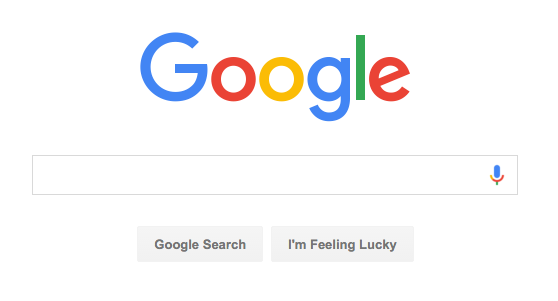
This is the area I'm trying to duplicate:

enter image description here

I was able to center the logo and the search bar with:

{margin-left: auto;
margin-right: auto;
display: block;}

I was able to center the buttons with:

#googleSearch {display: inline-block; margin-left: 520px;
margin-right: auto;}
#feelingLucky {display: inline-block;}

All of my code is below but my questions is: is there a better way to position the buttons and if so, what? Playing with the margin-left until it looks right seems to me like the equivalent of using a bunch of line breaks instead of changing the margin or padding.

li {font-family: arial,sans-serif;
font-size: 13px; list-style: none; display: inline-block;}

nav {text-align: right; padding-right: 160px; word-spacing: 10px;}

#userName {opacity: .55;}

a, a:visited {color: black; text-decoration: none;}

a:hover {text-decoration: underline;}

img, #searchBox {display: block;
margin-left: auto;
margin-right: auto;}

img {margin-top: 200px}

#googleSearch {display: inline-block; margin-left: 520px;
margin-right: auto;}
#feelingLucky {display: inline-block;}
<!DOCTYPE HTML>
<html lang="en">
<head>
<link rel="stylesheet" href="index.css">
<meta charset="UTF-8">
<title>Google</title>
<link rel="shortcut icon" type="image/x-icon" href="http://www.google.com/favicon.ico">
    </head>
<body>
<header>
<nav>
    <ul>
    <li><span id="userName">Jarod</span></li>
        <li><a href="https://accounts.google.com/ServiceLogin?passive=1209600&continue=https%3A%2F%2Faccounts.google.com%2FManageAccount&followup=https%3A%2F%2Faccounts.google.com%2FManageAccount">Gmail</a></li>
        <li><a href="https://www.google.com/imghp?hl=en&tab=wi&ei=yeCeVp3uLcyMmQH3mJ8w&ved=0EKouCBYoAQ">Images</a></li>
    </ul>   
    </nav>
    </header>
<img src="https://www.google.com/images/branding/googlelogo/1x/googlelogo_color_272x92dp.png" alt="Logo"> 
    <form action="#" method="get" name="searchForm">
    <input id="searchBox" type="text" name="searchBox"><br>
        <div id="googleSearch">
    <input id="two" type="submit" value="Google Search">
            <input id="feelingLucky" type="submit" value="I'm Feeling Lucky">

    </form>
    </body>
<footer></footer>
</html>

Is there a better way to position my buttons?

\$\endgroup\$
2
  • \$\begingroup\$ I have edited the content and I believe it meets the guidelines. \$\endgroup\$
    – Memj
    Commented Jan 20, 2016 at 6:03
  • \$\begingroup\$ If your code does not work in all the expected use cases, your question is off topic as broken code. \$\endgroup\$
    – user34073
    Commented Jan 21, 2016 at 2:14

4 Answers 4

2
\$\begingroup\$

Add both buttons in a single <div>, and center that div instead of the buttons individually.

\$\endgroup\$
0
\$\begingroup\$

Please don't format css like that. It's quite hard to read, and stuff runs together. Some nice simple rules:

  • Use a line break between each set of rules
  • Always separate each field on its own line
  • Try to organise the order in a way that makes sense. eg. starting with most broad categories and then getting increasingly specific:
li {
    font-family: arial,sans-serif;
    font-size: 13px; 
    list-style: none; 
    display: inline-block;
}

nav {
    text-align: right; 
    padding-right: 160px; 
    word-spacing: 10px;
}

a, a:visited {
    color: black;
    text-decoration: none;
}

a:hover {
    text-decoration: underline;
}

img, #searchBox {
    display: block;
    margin-left: auto;
    margin-right: auto;
}

img {
    margin-top: 200px;
}

#userName {
    opacity: .55;

}

#googleSearch {
    display: inline-block; 
    margin-left: 520px;
    margin-right: auto;
}

#feelingLucky {
    display: inline-block;
}
\$\endgroup\$
0
\$\begingroup\$

I agree with @jcaron: place the buttons inside a div container and use display:inline-block to center it. Additionally, you can wrap the logo and the buttons in a single div container to avoid reusing code.

\$\endgroup\$
0
\$\begingroup\$

I would go even further and put a wrapper div for your search bar, buttons, and image and then you only have to worry about centering the wrapper div. Then you can separate the content inside the wrapper div.

Also be careful with html formatting - a parent and child elements are not in the same level.

<html>
  <head>
   <!-- head contents here -->
  </head>
  <body>
      <header>
         <!-- header contents here -->
      </header>

      <div class="container">

          <div class="img-container">
              <!-- image here --> 
          </div>

          <div class="form-container">
              <!-- form with search bar and buttons here --> 
          </div>

      </div>
  </body>
</html>

You don't have to add the inner containers (img-container and form-container). It is just to give an idea on the layout.

\$\endgroup\$

Your Answer

By clicking “Post Your Answer”, you agree to our terms of service and acknowledge you have read our privacy policy.

Not the answer you're looking for? Browse other questions tagged or ask your own question.